Welcome back to Silver Images our ongoing examination of the 7 launch titles unleashed on an unsuspecting world by the 7 Image founding artists; Rob Liefeld, Todd McFarlane, Erik Larsen, Jim Lee, Jim Valentino, Mark Silverstri and Whilce Portaccio.
We have now covered roughly half of the IMAGE Revolution and as we move into the second half of this saga there is a definitely a sense that we reached the Zenith and are now moving into the descent from the top of the mountain.
With that being said let’s turn our gaze now to the possibly-ironic ultra-violence that is the debut issue Jim Valentino’s Shadowhawk from August 1992.

Shadowhawk Number 1 arrived towards the tail end of the Summer of 92, a summer which IMAGE had owned with the launch of Youngblood, SPAWN and Wild C.A.Ts (Covert Action Teams).
But even at this stage the early signs were there that the bloom was beginning to come off the IMAGE Comics rose. The follow up issues to the much hyped debuts were already showing the early signs of the trademark lateness that would plague IMAGE Comics through much of 1990s, the Marvel juggernaut showed it could bounce back without the IMAGE 7 by launching spin offs for Liefeld’s Cable and it’s new dystopian Cyberpunk 2099 line.
And then we have Jim Valentino’s Shadowhawk. Now I will be the first to admit that I did not have not read any of Valentino’s much hyped run on Guardians of the Galaxy and did not buy into the hype about Shadowhawk as a character at all. With that said, I will try and maintain as unbiased an opinion on the issue before me as possible.
Valentino was already a veteran of the comics field at this point having come up in to the business through 80s Black and White boom which bought us everything from TMNT, the Crow and Elf Quest to Madman and Bean World.

His signature creation of this period was Normalman, a parody / analogue of Superman who was the only non-powered individual in a world populated by Superheroes.
Valentino was already 40 by the time of the IMAGE Summer of 1992 a full decade older, if not more, than most of the other members of the renegade band of comic creators. More on my thoughts on what this means for Shadowhawk later on.
The first thing you’ll notice when you crack that first issue of Shadowhawk is that cover. With it’s heavy card stock and shiny foil cover depicting our heroes mask was certainly an iconic image (pun intended.)

Of course gimmick enhanced covers were already a main stay of comics from Marvel and DC at this point but this was IMAGE’s first enhanced cover.
Shadowhawk had already debuted in the second issue of Youngblood but our the bird of prey takes full flight in this debut story where we are introduced to Valentino’s “Nightmare Walking” in all his spine snapping glory..
I also feel like I should call out the dedication to Jack Kirby on the book’s inside cover. I mentioned in my review of SPAWN that this was most likely in reference Kirby’s long running battle with Marvel about ownership of his creations and his art but it bears repeating because at the end of the day we are all really living in the house that Jack and Stan built.
The story opens up on the streets of Lower Manhattan as a gang of fairly typical street toughs are looking to commit some fairly typical street crime on a vagrant pushing a shopping trolley.
But SHOCK HORROR it’s not your regular common or garden variety of homeless person it’s our (anti)hero Shadowhawk
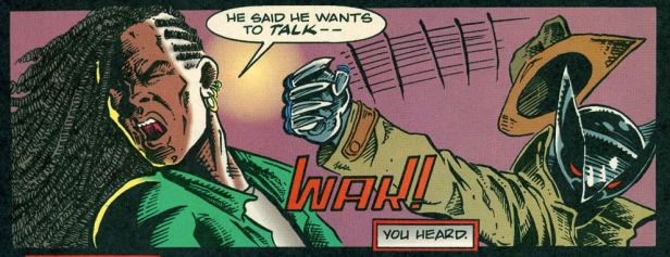
Over the course of a half a dozen panels and two or so pages Shadowhawk dispatches this hapless gang of good for nothing gang-bangers.
But Wait! The fight’s not over!
Because it’s 1992 and all the cool kids at the arcade are starting to whisper and wonder about this new Mortal Kombat game it’s time for Shadowhawk’s FATALITY!
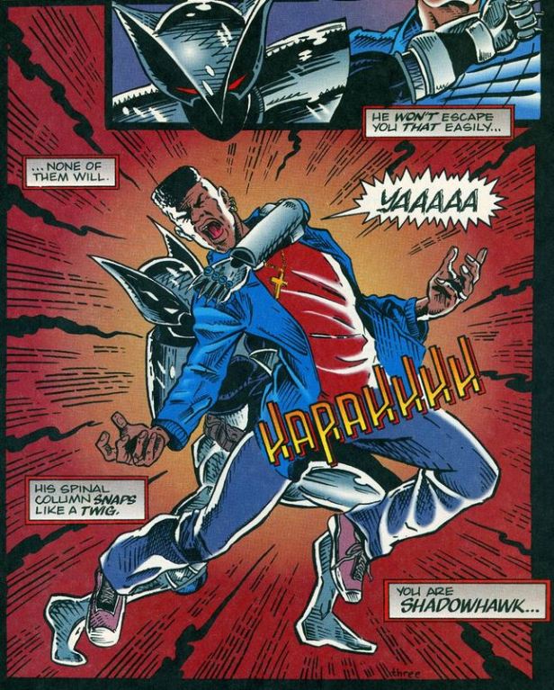
If you only knew one thing about Shadowhawk prior to reading this issue you probably knew that our hero is all about spinal trauma.
The police are corrupt
The courts are inept
The prisons have a revolving door
Only Shadowhawk’s unique brand of street justice is absolute.

You will notice that our hero certainly likes to narrate to himself.
Narrate in a grim and gritty voice that is so over the top you have to wonder if Valentino is being ironic or if he is DEADLY serious.
This grim dark almost cringe-worthy iron age tone persists through the remaining 20 odd pages of the issue.
Shadowhawk foils another mugging and breaks even more spines before being drawn to a fire destroying an inner city apartment block.
A blaze being set off by a rogue fireman called (sigh) Arson.
Arson who appears to be working for a female Kingpin equivalent called Ms Boldd (yes Bold with a Double Dee because reasons?).
Really what even is going on here!
If this comic was published a few years later I would say this is written with tongue firmly in cheek with the kind of ironic humour that you might expect from Ben Marra’s Traditional Comics but there is no reason to think that Valentino is being anything other than serious.
I highlighted earlier Valentino’s age compared to the other young upstarts of the Image 7 and this is really when it begins to show. This story is full of that kind of that “young people’s” dialogue which comics are infamous for. The kind of story telling you get when Stan Lee or Bob Haney tried to write the way “the kids” of today speak.
Valentino would later remark that he felt pressured to deliver a character and a story akin to the upstart works of the other members of the IMAGE 7 and it really does show throughout this issue.
It’s jarring, almost laughable at points and enough to pull the reader out of the story.
Valentino’s design for Shadowhawk also makes no sense.


I mean he is basically Silver Wolverine right down to the helmet but then he’s also got Batarangs, so does that make him basically proto-Knightfall Batman?
And then he’s silver. Shiny, reflective silver.
A costume that will reflect the most amount of light possible.
But he’s a shadowy avenger in the dark, hungry for justice and looking for spines to snap.
What is even going on!?!
Subsequent issues would go on to add some much-needed nuance to Shadowhawk but this debut issue is all shock and no substance.
Over its 18 issues initial run Valentino would attempt to use Shadowhawk as a vehicle for social commentary on the inner city issues of crime, poverty and the drug trade and would also attempt to tackle more complex issues of race and identify with his revelation of that his hero was a HIV Positive African American man.
Sadly however there is nothing in this first issue to suggest that Shadowhawk is more than just a “grown up” Batman who was tired of “playing by the rules” and had already seen Frank Miller execute that idea almost perfectly in the Dark Knight Returns back in 1986.
What this Book Gets Right:
- That Cover: You can’t deny eye catching power of the cover to this debut issue of Shadowhawk. With it’s shiny chrome finish, the protagonist’s leering mask and the rhetorical question “Who is Shadowhawk” this book would certainly have jumped out at prospective readers on their weekly trip to their local comic shop.
- The Art: It’s clear that Valentino is an accomplished artist from that 1980’s black and white indie comics boom. While his work doesn’t have the hyper detailed approach of Lee or Silvestri or the distorted body builder anatomy of Liefeld it’s very clear that Valentino is no slouch either, he just maybe isn’t the right artist for this particular story.
- Thrill Power: say what you will about this story it certainly is shocking from its first spine shattering page to its last. Had I picked this up as a 14 years back in the day this probably would’ve been enough for me but sadly that’s not the case any more.
What this Book Gets Wrong:
- The Colouring: The colouring by Digital Chameleon does this book no favours. We talked about the shiny, 90s Goth Dark World of Todd McFarlane’s SPAWN in our review of that issue. Well Shadowhawk is pretty much the opposite, the colours are oddly rich and warm with none of the inky blackness you would expect from such a grim and gritty character concept.
- The Villains: Arson and Ms Boldd, that’s the best you could come up with? Did you spend more than a cup of coffee coming up with those names because if so you should be ashamed.
- The Costume: He’s Wolverine Batman wrapped in more shiny tinfoil than a bauble on a Christmas tree, it couldn’t be any more ineffective a costume unless it had some sort of Tron style LED light up effect.
Final Verdict, should I read this book? No, this is an instantly forgettable and frequently laughable comic. You’ve got better things to do with a few dollars and a few minutes of your time.
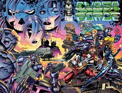
Next Time: Boy Shadowhawk was a rough ride, is this a sign of things to come? Join us next time for the penultimate installment of Silver Images as tries to surf the web and log on to Mark Silvestri’s Cyber Force!